
Also from my birthday pile, is this wonderful Sleek Makeup- I-Divine Candy Collection Limited Edition Makeup Palette. When I first saw it in its packaging, I thought 'Wow, the packaging is quite pretty, but is this any good? I've never used anything by Sleek Makeup except for its contouring set which I absolutely love to bits. So, I went to Google and did some research on it at the specific Sleek Makeup website for it as well as to read some reviews.
The results were pretty exciting. The website showed how the palette look and gosh .__. I was utterly mind blown. IT LOOKED SO GORGEOUS OH GOSH. Here's a picture of it before I start fangirling an rambling.

Doesn't it make you go 'Wow! So cool!!' ? The colours look fantastic. They look so strong and vibrant and I prayed quite hard that they will turn out looking as they do when it is applied onto your skin. Too many a time have I been cheated by strong looking colours that end up being really pale on your skin.
To my relief though, most of the reviews mentioned that it was really pigmented, smooth and easy to blend. Thank the norns (Kudos to you if you know where this came from ;D) I really had it with eyeshadows that don't really blend well. In all my attempts to blend the eyeshadow, I either find myself seemingly digging my eyeballs out of their sockets, or unevenly blending them so that one side of my eyelid is light in colour while the other side is dark in colour.
At this point, I think that you may be thinking. 'What kind of makeup is she using??' Ah, I'm not saying any names. That brand is normally quite good, so I just blame it on my luck and lack of skills sigh.
Ahh, I think I have really rambled too much. Time to start talking about the product!
This is what Sleek Makeup has to say about it!
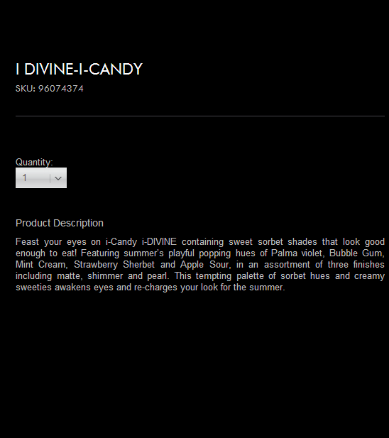
The names sound so exciting don't they! I really love to look at the various names that companies give their makeup. It's pretty cool! Can you imagine a colour being called Gloomy? I envision that it would be a Greyish-Pinkish colour . Got the idea from Gloomy Bears :D

Well, this is the packaging/box that it came in and I really appreciate the thought that went into this. I mean, the designer could just use plain ol' cupcakes for the cover, but they didn't. Instead, they chose to use cupcakes(?)/papers(?) in the form of roses to act as the cupcakes, which I think was quite innovative. I really like that the background was white, because otherwise, it would be drawing people's attention away from the pictures.

Inside the palette was
- A mirror (The box is covering it :<)
- 12 different eyeshadows
- A double ended brush
- A piece of plastic with the names of the various eyeshadows printed on it
I'll name and review the colours in batches of fours, so that its not so confusing for us all o.o Two colours from the top row and two colours from the bottom row will be considered a 'batch' :)

Sorry for the grainy texture ):
Lets start from top to bottom, left to right!
The above colours are Strawberry Sherbet, Bon Bon, Liquorice and Blue Fizzle.
Strawberry Sherbet was pink and funky, reminds me of Barbie and strongly pigmented! It turned out on the skin the same as when it was on the palette!
Bon Bon was shimmery, a nice mixture of red and pink, reminds me of Barbie as well and not so strongly pigmented! It turned out to be not as concentrated as it looks, when you apply it, it seems to spread out on its own. When you apply it to a certain area and compare it with another matte eyeshadow, it is quite obvious that Bon Bon looks lighter and doesn't stick to the area that it is applied on so much.
Liquorice was dark, pigmented, concentrated and reminds me of Batman. Unlike other black eyeshadows that ends up fading to grey, this eyeshadow remains a solid black and is definitely a good substitute for eyeliner should the need ever arises o.o
Blue Fizzle was shimmery, a nice shade of dark blue that is bordering on dark purple, reminds me of the evening sky before the light completely fades out and its not so strongly pigmented as well! However, unlike the Bon Bon eyeshadow, this looks quite close to how it looks like on the palette! Minus the looking like dark purple at some points though.

The above colours are Parma Violet, Apple Sour, Aniseed and Bubble Gum!
Parma Violet was pigmented, turned out darker than it looks in the palette, and reminds me of eggplants o.o
Apple Sour was a nice mix of green and blue, and like all its other predecessors, turned out not so strongly pigmented. While it looks like and reminds me of the sea in Greece, it actually turns out to be more of a turquoise, greenish looking colour when you apply it to your skin!
Aniseed was like Bon Bon, a nice mix of red and pink, and it reminds me of Barbie also ._. I give up. Almost everything that is vaguely pink, I will just link it to Barbie okay. This eyeshadow, being a shimmery one, is unsurprisingly, not so pigmented. However, when you apply it, the colour is actually a darker shade of pink going towards red. Do you get what I mean? As in it looks darker on your skin but like all other shimmery products, it is not as concentrated as the other matte eyeshadows.
Bubble Gum was not aptly named I think o.o Due to my unknown strong belief that anything named Bubble Gum should be pink. I wonder how I developed that sort of thinking o.o This eyeshadow is a nice shade of Sky Blue that reminds me of forget-me-nots. This eyeshadow is different from the other eyeshadows in the sense that it actually appears lighter when you apply it on your skin. It's a good base if you want to layer many shades of blue!

These are the last four colours! And they are Pear Drop, Flump, Mint Cream and Cream Soda!
Pear Drop was a brilliant shade of neon looking light green and it is my favourite colour out of this whole batch of eyeshadows! It is so strongly pigmented and it simply makes your eyes pop!The colour somehow reminds me of acid though o.o I sort of expected it to be named Acid Apple or something along these lines LOL.
Flump was a nice shade of violet and it strongly reminds me of this purple Gloomy Bear that I have at home! While it was a matte eyeshadow, sadly, it wasn't as concentrated as the other eyeshadows! It is still quite pigmented though! :)
Mint Cream, was a mix of blue and green, though it sort of gravitate towards a green turquoise colour! It reminds me immensely of Hatsune Miku's hair. Though, when you apply it to your skin, the colour ends up looking rather greenish unlike its blueish appearance in the palette! It is also not strongly pigmented ): I suggest you use this as an eyeshadow base
Cream Soda, was a shimmery whitish beige-ish colour and it reminds me of the cream that felines love! While it may not be as pigmented as the other matte eyeshadows, I believe that it can act as a great waterline highlighter! It may not be very pigmented but it is quite concentrated if you apply it carefully!
If I have to rate this, I'll give it a 8.5/10? because the packaging was good, most of the colours were pigmented and even those that weren't very pigmented, were also good, smooth, blend-able and easy to use! Price wise, I can't comment because I don't know the price of the palette. Let me know if you do? I'll do the reviews for my other palettes when I have the time!
Ahh, thats for all! Thanks for sticking by and reading through this whole post! Sorry if my review wasn't up to your expectations. Will try harder! However, I hope that you have a vague idea of what you are in for when you buy this or receive this like I did! :)
Cheers!

UPDATE (11/10/13) : THE ABOVE PRODUCT CAN ALSO BE PURCHASED FROM HERE :) ENJOY!
No comments:
Post a Comment